NBK
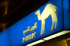
NBK recently did a re-branding. They updated their logo with a red swish. Its terrible what they did. I really don't like the red nor the swish and find no reason for it. Not only that but I heard that when NBK were having their logo redesigned they had requested for versions of the logo WITHOUT the camel! IMAGINE THAT! NBK without the camel. I have known NBK since their old camel in a hexagon logo when they were using gold and dark green. For them to come and remove the camel now would be the stupidest thing they can do. NBK is so Kuwait, the blue, the camel, its very patriotic. But now they have the stupid red swish underneath and they were considering the removal of the camel.. I am just very shocked. By the way the log in the picture is the old one, for the new version go to nbk.com
posted by Mark at 7:55 PM
![]()
![]()

2 Comments:
As an ex-NBK employee... I fully agree with you.
A little background though.. NBK is possessed/obsessed with Gulf Bank and its bold red identity (the best in Kuwait I think, and damn proud of it too as an ex-GB employee as well) This little red swish is meaningless, and is probably their feeble attempt to inject some red into their logo. Probably cost them KD 500 which is nothing and just reflects their notorious cheapskate-ness
If they would only fork out some cash for a complete branding project... sigh!
Man, i cant tell you exactly how much they spent but its in the tens of thousands of dinars.
Post a Comment
<< Home